When it comes to website design, aesthetics are only half the battle. The real game-changer is psychology—the way colors and fonts influence user emotions, perceptions, and decisions. Every element on a website, from the color of a call-to-action button to the typeface used in a headline, can directly impact conversion rates. Businesses that understand these subtle yet powerful design choices can guide users toward engagement, trust, and ultimately, sales.
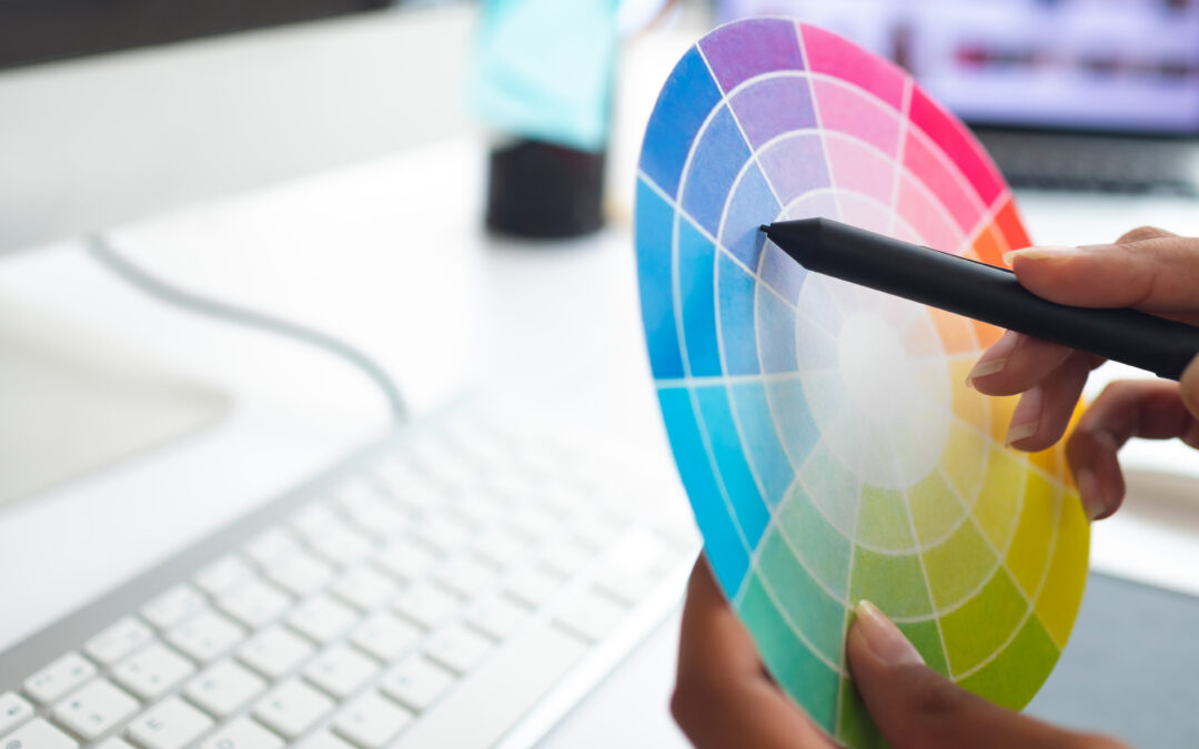
Color psychology plays a crucial role in shaping user behavior. Different colors evoke different emotions and associations, which can either encourage or deter a visitor from taking action. For example, red is often linked to urgency and excitement, making it a common choice for limited-time offers. Blue, on the other hand, conveys trust and stability, which is why so many banks and tech companies use it in their branding. The key is to align color choices with the brand’s personality and the desired user response. A wellness brand may thrive with calming greens and soft neutrals, while an e-commerce store might see better results with bold, high-contrast colors that create a sense of energy and action.
Fonts, though often overlooked, also play a major role in user experience and conversions. The readability, style, and even spacing of typography can affect how a visitor perceives a brand’s credibility. Serif fonts like Times New Roman or Georgia convey a sense of tradition and authority, making them ideal for law firms or financial institutions. Sans-serif fonts like Helvetica or Arial feel modern and clean, which is why tech startups and minimalist brands favor them. Beyond aesthetics, font weight and spacing matter, too—cluttered, hard-to-read text can frustrate visitors and drive them away, while well-structured typography encourages them to stay and engage.
The combination of colors and fonts must be intentional, reinforcing the brand’s message and guiding users toward a desired action. A site with high-contrast text and vibrant, strategically placed buttons can draw the eye to key elements, improving click-through rates. In contrast, a poorly designed site with mismatched colors and inconsistent typography can create cognitive dissonance, making visitors hesitant to trust the brand or take action. It’s not just about making a website look good—it’s about making it feel right.
Emotional triggers also come into play. Warm colors and friendly, rounded fonts can make a brand feel approachable, while cooler tones and sharp, structured fonts convey professionalism. Even the smallest details, like button text in all caps versus lowercase, can subtly influence how a call-to-action is perceived. These micro-decisions add up, shaping the overall user experience and determining whether visitors feel compelled to engage or leave.
Ultimately, web design isn’t just about aesthetics—it’s about persuasion. Colors and fonts work together to create an experience that either encourages users to stay, trust, and convert or pushes them away. Understanding these psychological triggers allows businesses to design websites that not only look visually appealing but also drive meaningful interactions. By making

